

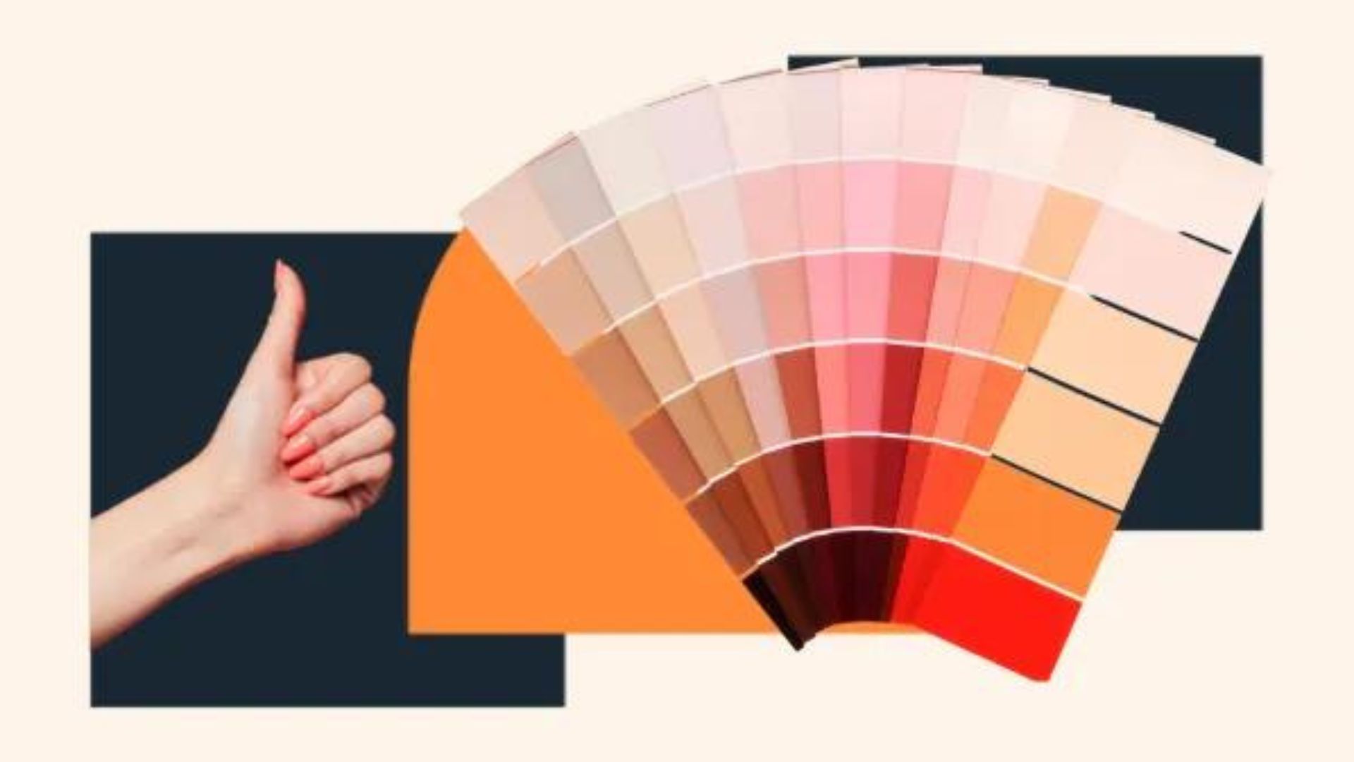
Best Color Palettes for Modern Design
Choosing the right color palette is crucial for modern design. The colors you select can set the tone, evoke emotions, and create a visually appealing experience. Here are some of the best color palettes for modern design.
1. Minimalist Monochrome
Minimalist monochrome palettes use variations of a single color. This approach creates a sleek and sophisticated look.
- Why It’s Popular: Monochrome designs are clean and elegant. They work well in modern design, emphasizing simplicity and clarity.
- Best For: Creating a sophisticated and streamlined design with minimal distractions.
2. Cool Blues and Greens
Cool blues and greens offer a calming and refreshing vibe. This palette often includes shades of blue, teal, and green.
- Why It’s Popular: These colors evoke tranquility and nature. They’re great for designs aiming to convey a sense of calm or environmental consciousness.
- Best For: Websites, apps, and branding that focus on wellness, nature, or technology.
3. Warm Neutrals
Warm neutrals include shades of beige, taupe, and brown. This palette adds warmth and coziness to modern designs.
- Why It’s Popular: Warm neutrals create a welcoming and comfortable atmosphere. They blend well with other colors and textures.
- Best For: Interior design, lifestyle blogs, and branding that emphasize comfort and warmth.
4. Bold Contrasts
Bold contrasts feature high-contrast color combinations like black and white or navy and gold. This palette makes a strong visual impact.
- Why It’s Popular: High-contrast colors grab attention and create a dramatic effect. They’re ideal for designs that need to stand out.
- Best For: Fashion, high-impact advertisements, and modern art projects.
5. Pastel Shades
Pastel shades include soft colors like blush pink, mint green, and lavender. This palette is gentle and soothing.
- Why It’s Popular: Pastels offer a subtle and inviting look. They are often used to create a soft, modern aesthetic.
- Best For: Websites for creative industries, beauty brands, and products aimed at a youthful audience.
6. Earth Tones
Earth tones feature colors inspired by nature, such as terracotta, olive green, and deep brown. This palette connects with natural elements.
- Why It’s Popular: Earth tones bring a grounded and organic feel to designs. They are perfect for designs that emphasize sustainability and nature.
- Best For: Eco-friendly brands, natural product packaging, and outdoor-themed projects.
7. Vibrant Pop Colors
Vibrant pop colors use bright, eye-catching hues like electric blue, hot pink, and lime green. This palette adds energy and excitement.
- Why It’s Popular: Vibrant colors energize and attract attention. They’re great for making a design feel lively and dynamic.
- Best For: Youth-oriented brands, tech startups, and promotional materials.
8. Classic Black and White
Classic black and white palettes are timeless and versatile. This combination creates a clean and professional look.
- Why It’s Popular: Black and white designs are simple yet elegant. They provide a strong contrast and are highly adaptable.
- Best For: Corporate branding, editorial design, and high-end fashion.
9. Gradient Colors
Gradient colors blend multiple shades to create a smooth transition. This modern technique adds depth and dimension.
- Why It’s Popular: Gradients add visual interest and a sense of motion. They are often used to create dynamic backgrounds and effects.
- Best For: Tech products, creative websites, and contemporary branding.
10. Retro Color Combos
Retro color combos draw inspiration from past decades, such as mustard yellow and avocado green. This palette offers a nostalgic feel.
- Why It’s Popular: Retro colors evoke a sense of nostalgia and uniqueness. They give modern designs a vintage twist.
- Best For: Retro-themed projects, vintage brands, and creative campaigns.
Conclusion
Choosing the best color palette for modern design involves considering the mood, message, and audience of your project. Minimalist monochrome, cool blues and greens, warm neutrals, and bold contrasts each offer unique advantages. Pastel shades, earth tones, vibrant pop colors, classic black and white, gradient colors, and retro combos all provide different aesthetics. By selecting a color palette that aligns with your design goals, you can create visually appealing and effective modern designs.


how to buy enclomiphene medication interactions
buy enclomiphene in United Kingdom
enclomiphene australia cost
comment faire prescrire un médecin kamagra
kamagra ups
sans ordonnance kamagra en canada
buying androxal australia suppliers
buying androxal without a script
online order androxal cheap next day delivery
online order dutasteride cheap wholesale
buying dutasteride generic australia
dutasteride usa overnight delivery
how to buy flexeril cyclobenzaprine cheap to buy online
ordering flexeril cyclobenzaprine buy for cheap
cheap flexeril cyclobenzaprine purchase singapore
buying gabapentin uk buy online
buying gabapentin generic gabapentin
get gabapentin generic lowest price
purchase fildena cod cash delivery
get fildena generic united states
cheapest buy fildena buy in the uk
cheapest buy staxyn australia buy online
get staxyn purchase generic
discount staxyn cheap info
buy cheap itraconazole generic effectiveness
purchase itraconazole buy in the uk
purchase itraconazole cost tablet
avodart with next day delivery without prescription with free shipping
online order avodart uk cheapest
online order avodart uk online pharmacy
buy rifaximin generic brand
buy cheap rifaximin generic from india
cheap rifaximin prescriptions
how to order xifaxan canada on sale
discount xifaxan generic new zealand
order xifaxan purchase singapore
kamagra přes noc žádný skript
kamagra online předpis
objednat levné kamagra online